
You can spot an agency template from the other side of the feed. The logo changes. The gradient does not. It is efficient, right up until every brand looks like it shops at the same visual supermarket.
Read the brief before opening the canvas
Different brands need different visual languages. An insurance product may need clarity and trust. A hospitality property may need atmosphere. An automotive launch may need pace, technical confidence and enough restraint to let the product speak.
That is why the same design rules cannot be pasted over every account. We begin with the audience, the message and the setting in which the work will appear. The result should feel unmistakably like the client, even before someone notices the logo.
Build a system that can still surprise
Consistency helps people recognise a brand. Repetition can make them stop seeing it. A good visual system gives designers useful boundaries and enough room to respond to a new campaign, photograph or idea.
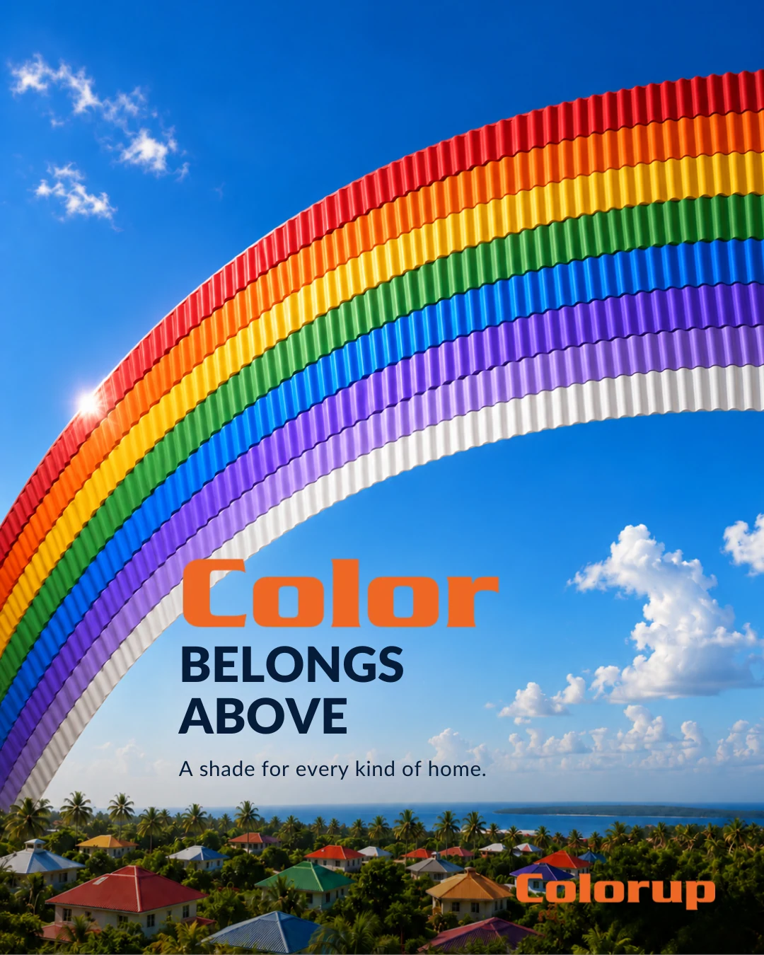
Our selected stills include carefully art-directed product work, hotel photography and campaign graphics. They share a standard of execution. They do not share one visual costume.
Judge the work in context
A static post is not a poster hung in a quiet gallery. It arrives between messages, Reels, friends and distractions. Type needs to read at a real size. The image needs a reason to exist. The call to action should be clear without sounding like a person shouting from a moving bus.
We look at the design on the screen where it will live and alongside the rest of a campaign. A single beautiful frame can be satisfying. A coherent collection does more for the brand.
A brand should look like itself on its best day.
What this means for a brand
Bring the business problem, the audience and the evidence into the same room as the creative work. Then judge the result in the place it will actually be seen. That is how a campaign becomes more than a collection of attractive files.
Want to see what that thinking looks like? Explore selected Echt Social work ↗